How to make a Pivot Table
Now that we know what a Pivot Table is, it's time to learn how to make one! In the following tutorial, we'll start with a basic data set, learn how to create a Pivot Table based on our data set, go over the basic features of one- and two-dimensional Pivot Tables, and then examine some more advanced options for Pivot Table creation and manipulation.
Preparing the data
Before we dive into making our Pivot Table, it's important to ensure that our input data is in the proper format. Pivot Tables are always generated based off of an initial table of
What is
That may seem a bit complicated, so let's take a look at a sample table to help explain things. The following is an example of a poorly formatted input table:
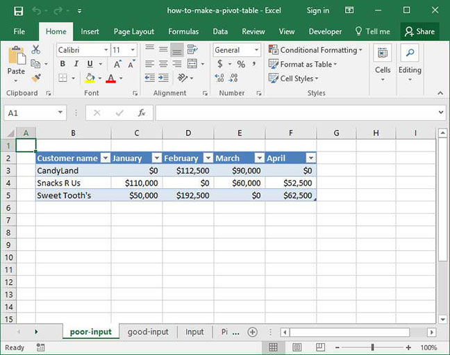
Although this is a perfectly reasonable summary table to create in Excel, it violates the first rule of flat file format: each column heading does not contain a type of data, but rather a data value.
Our bad example above could be fixed by creating a
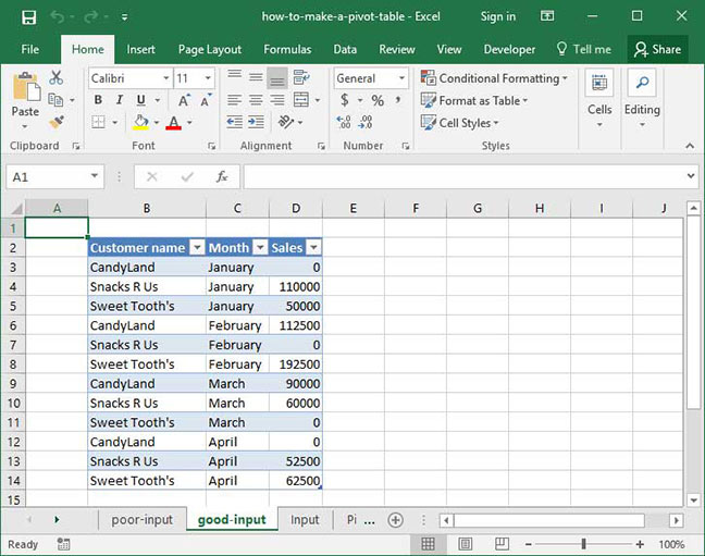
Notice that now, each column represents a data type (
Here are a couple of additional considerations when preparing your data for Pivot Tables:
- Use input data in flat file format
- Build your data from top to bottom, not across. Each column should represent a type or characteristic of your data, and each row should represent an individual data point.
- Make sure Each column has a single heading, and all pieces of data within that column are of the same type. For example, if you have a
Date column, it's important to ensure that every value within that column is a date.
- Ensure that each column has a header; this header should accurately describe its contents and is easy to understand
- Remove all total and subtotal rows from your input data; otherwise, your Pivot Table will count them as individual data points
- Eliminate blank cells from your data set; this isn't necessary, but will help your Pivot Table identify data types
Making the Pivot Table
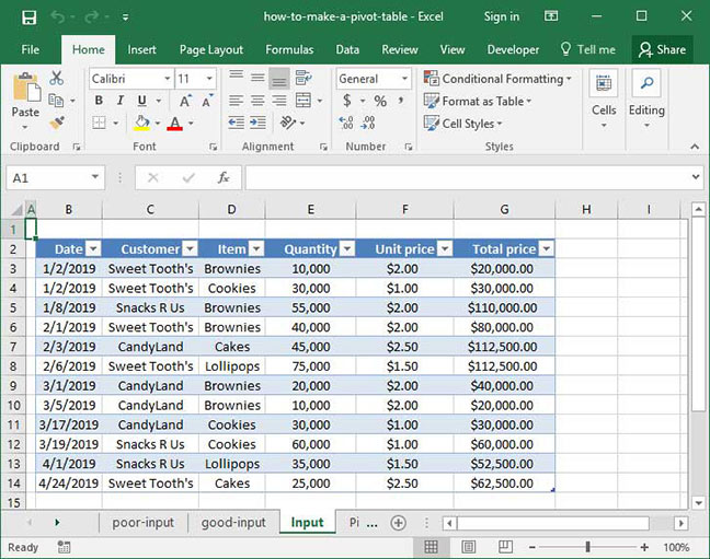
Now that our data is in the right format, we can move on to creating the pivot table itself. For this tutorial, we've expanded on the sample data set above, adding in some more granular detail on items ordered, quantity, price, and date:
To create a Pivot Table based off of this data, we'll first place our cursor anywhere within the data set itself. Then, we'll go to the
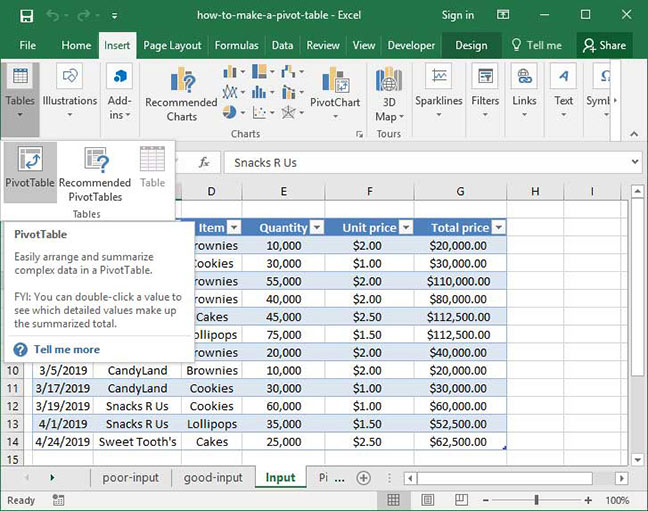
The
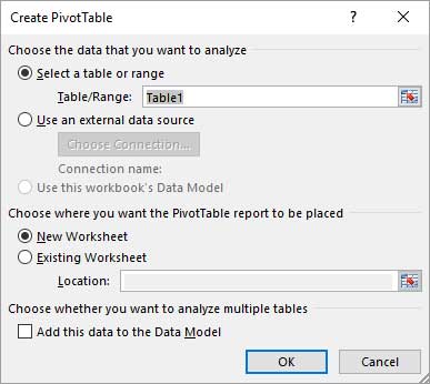
Our Pivot Table is ready to go! Notice that Excel has created a new sheet; there is now a Pivot Table graphic on the left-hand side of the screen; and a
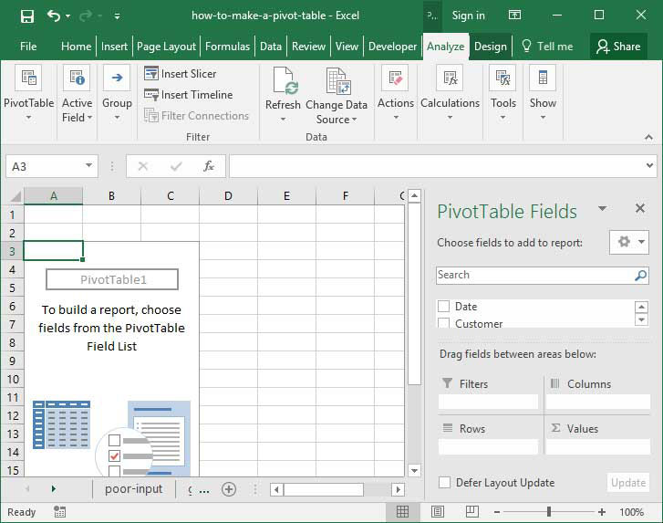
Note that our PivotTable Field List contains a summary of all the columns Excel identified within our input data set. Below, it also contains four sections:
- Report filter. This section allows us to filter our table by one or more criteria. For example, we can only show data in our Pivot Table for the month of January.
- Column labels. This section allows us to summarize data across columns, placing data labels along the top of the screen.
- Rows labels. This section allows us to summarize data across rows, placing data labels along the side of the screen.
- Values. This section allows us to specify what we're summarizing — for example, total sales or number of items ordered.
This may all seem a little complex, so let's move on to a real-life example of Pivot Tables in action to clarify things.
Creating a one-dimensional summary
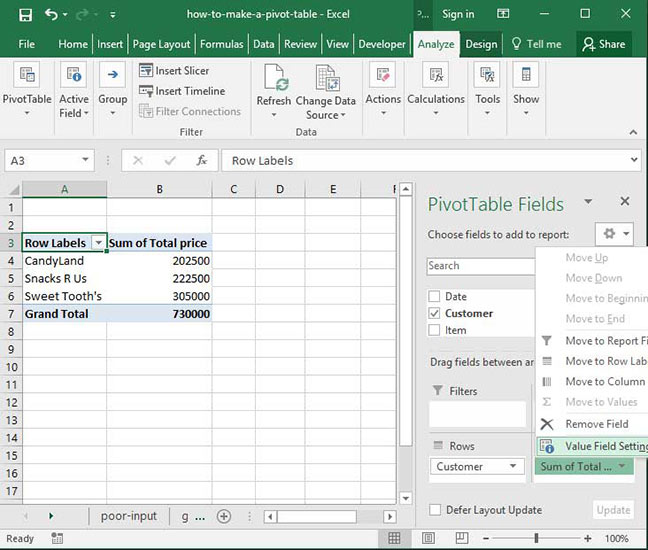
Now that our Pivot Table is created, let's start by creating a basic summary of total sales by customer. First, add the
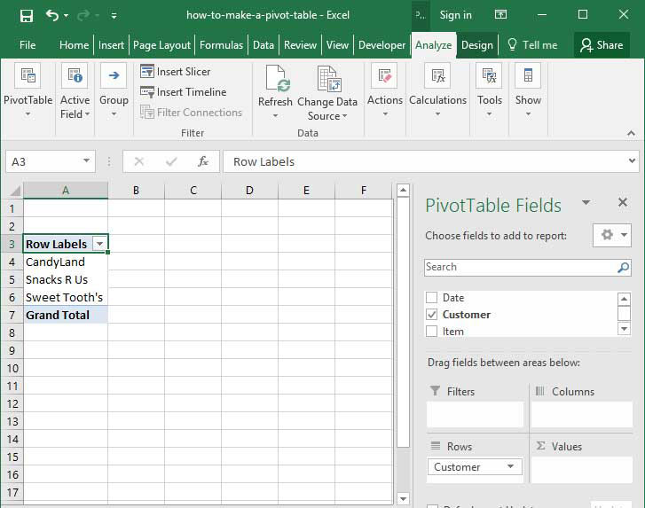
Once we've done this, notice a few things: first, the
A list of customer names is nice to have, but not particularly useful for data analysis purposes. Let's make things more useful by dragging the
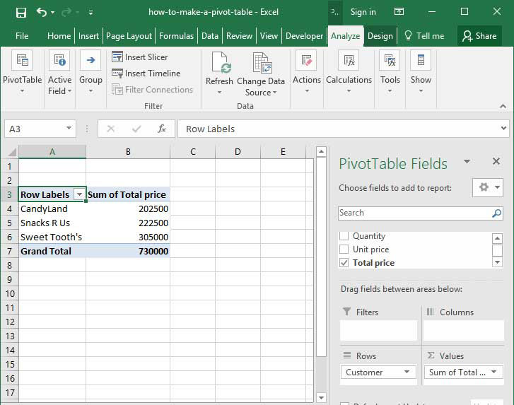
Now we're getting somewhere! Our table has summed up the values in the
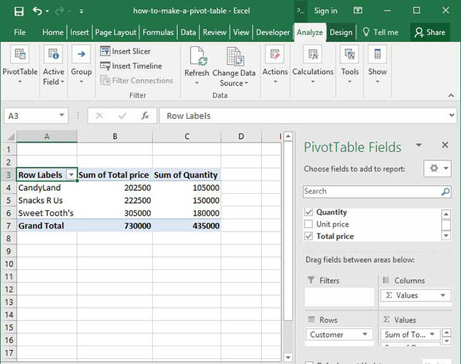
Like magic, we have a summary of total price paid and total quantity of products ordered by customer. We didn't need to write any formulas or copy and paste any values — our Pivot Table has done all of the work for us!
Creating multi-dimensional summaries
The value of Pivot Tables doesn't stop at one-dimensional summaries. We can also create multi-dimensional summaries that cut our data based on two values rather than one. Here's how:
With our data set above, let's first remove the
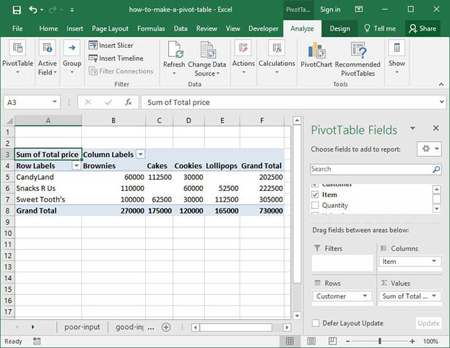
Notice that Excel responds by creating a two-dimensional summary table. Now, customer names are on the left-hand side of the screen, and item types are listed along the top. At the intersection of each customer name and item type, we see the total amount of the given product ordered by the customer in our whole data set. Excel automatically creates
Our multi-dimensional summaries don't stop with just two columns. Try dragging some of our other columns into the
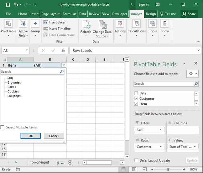
Filtering our data
There's one last key piece of Pivot Table functionality that we haven't yet examined:
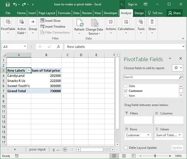
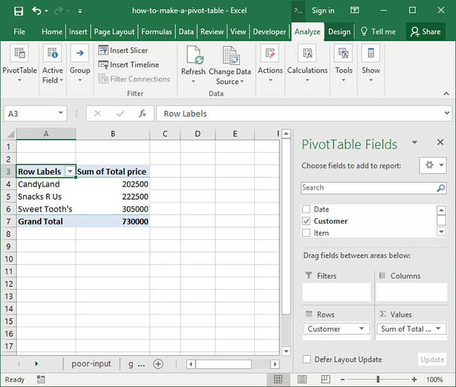
Let's start by resetting back to our standard Pivot Table, which shows an overall summary of total sales by customer:
Now, grab the
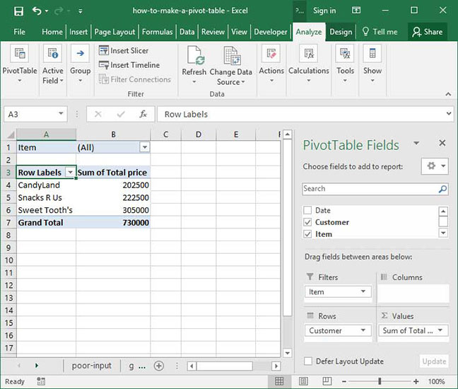
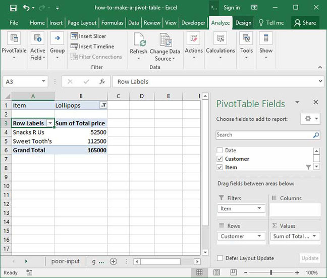
You'll notice that a new dropdown appears at the top of our Pivot Table. This dropdown will allow us to filter our report on individual items rather than seeing an aggregate summary of the entire input table. To see how it works, select
Our report now only includes sales of
We can also filter based on multiple values. Try opening up the filter, then clicking the checkbox that says
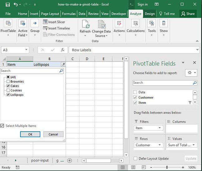
Try playing around with filters some more to get a feel for how they work — and how you can use them to quickly and easily gather insights from Pivot Table data. Notice that we can drag as many fields as we want into the
Summarizing things other than SUMs
So far, we've been summarizing all of the data in our Pivot Table using the
Let's test this functionality by starting with our standard summary of total sales by customer:
You'll notice that in the
First, click the small arrow next to
In the
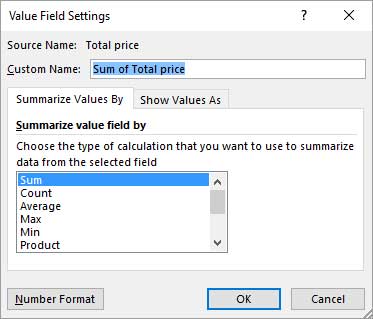
Notice that now instead of displaying the
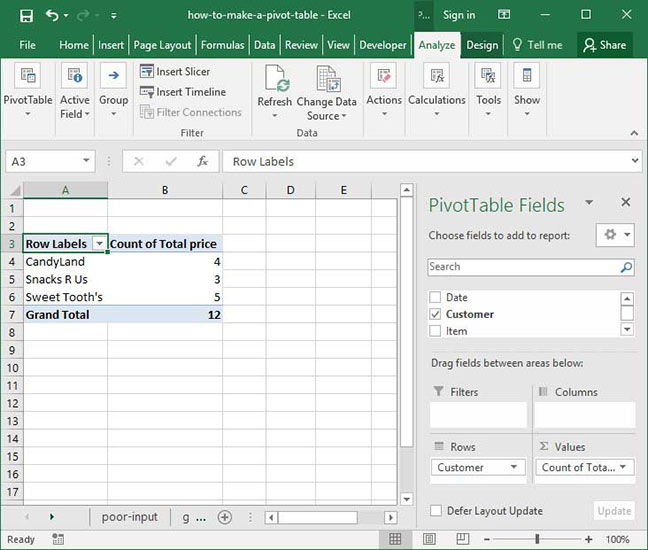
Try playing around with the other options in the
Grouping column headings
Let's say that we wanted to summarize sales by customer and month in our Pivot Table. Let's drag the
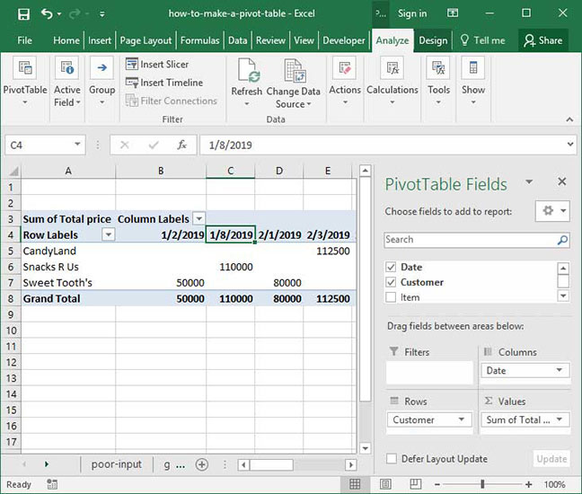
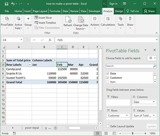
We've successfully summarized sales by customer and date. But the above output isn't particularly useful, is it? It shows our customers' sales by date rather than summarizing things on a monthly level. Is there a way to fix this problem?
There is — by using a Pivot Table feature called
With sales summarized by customer and date, right-click any date's header label and select the
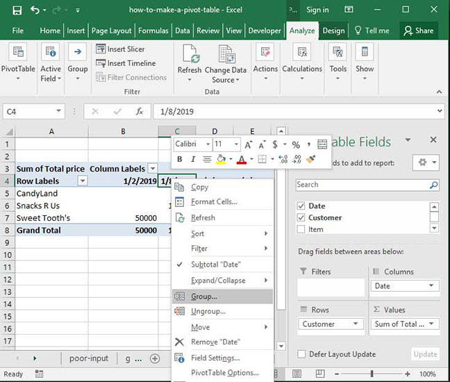
A
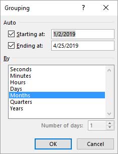
Click
Dates are the most commonly grouped columns, but it's also possible to "bucket" numerical columns by grouping them in segments. Try dragging the
Those are the basics of how to make a Pivot Table in Excel! Questions or other thoughts on what we've outlined below? Be sure to let us know in the Comments section at the bottom of this page.
Save an hour of work a day with these 5 advanced Excel tricks
Work smarter, not harder. Sign up for our 5-day mini-course to receive must-learn lessons on getting Excel to do your work for you.
- How to create beautiful table formatting instantly...
- Why to rethink the way you do VLOOKUPs...
- Plus, we'll reveal why you shouldn't use PivotTables and what to use instead...