How to make a chart in Excel
You've gathered some data in Excel and learned a number of useful functions and formulas for manipulating and parsing it. But raw data can be difficult to interpret — particularly if you're working with a data set that contains hundreds, or even thousands, of rows. So, it's time to learn how to display your data visually using charts and graphs.
Charts are one of the most powerful features of Excel. They allow you to display one or more series of data in a number of useful visual formats — including bar graphs, line graphs, pie charts, and scatter plots. In this article, we'll show you how to make a chart in Excel, and explore some of the most common chart formatting options.
The input data
Every chart in Excel starts off with raw data. In this article, we'll use a sample table containing SnackWorld's 2019 sales by month and product category, shown below:
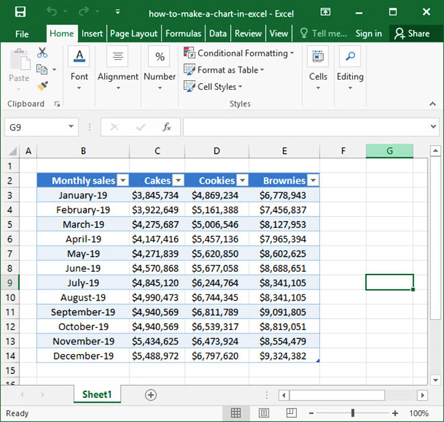
There are a couple of important things to note about our source data set before we begin:
- Consistent x-axis labels in the first row. Our chart contains data points for all of our desired x-axis labels — in this case, each month of the year — in the first row. In our sample data set, these labels are formatted as dates, starting in January and ending in December. Note that we've listed every month in order in the
Month column, and all month values are formatted in Excel's numerical date format (see our date format tutorial for more information). The column by which we'd like to graph results —Month — is the first column in our table. Not all charts need to be formatted as time series; they just have to include a consistent data type for the x-axis in the first column. - Similar types of data. After the
Month column, we have a number of other columns representing similar types of data:Cookies ,Brownies ,Cakes , etc. Note that each of these columns contains a comparable data point: monthly sales for the given category of good. - Complete data table. Finally, our data table is complete. There are no missing months, and no gaps in our sales data by category.
Whenever you're making a chart, go through the above list to ensure that your input data table is formatted properly. The vast majority of chart-based errors in Excel can be solved easily by fixing your data input table!
Making the chart
Now that you've got your data formatted and ready to go, it's time to make your chart. To start things off, select all the data in your table using your mouse, or by selecting any cell within the table and pressing Ctrl + A using Windows or ⌘ + A on a Mac.

With your table selected, head to the
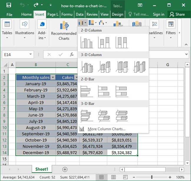
A new chart will immediately appear next to your data table. Notice that Excel has handled a lot of the nitty gritty here for us: the chart contains all of our data, and has automatically populated X-axis labels (based on the months in our data set), Y-axis labels (based on our total sales numbers), and a legend (based on our various product types). We've created a tool that allows us to visualize our yearly product sales trends with just a few simple clicks!
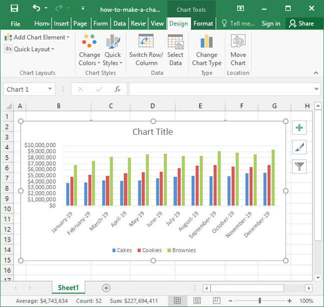
Changing the chart type
Let's say that after creating your chart, you realize that it's not the best way to display the data you want to show. In the above example, for instance, the chart shows a good idea of how sales for each individual product category is trending over time. However, it gives very little insight into what's happening to total sales month-by-month. A stacked bar chart — with the full bar height representing total sales, and colored segments within that bar representing invidual categories — might do a better job showing our data.
To change the chart type, right click the chart and select the

On the following screen, select a new chart type to display your data. Chart types are displayed with graphical examples, so that you can get a good idea of what the final product will look like. In this example, we'll select

Our chart type immediately changes to a stacked bar chart. Now we can easily get a look at both total company sales and individual product category sales in one place!
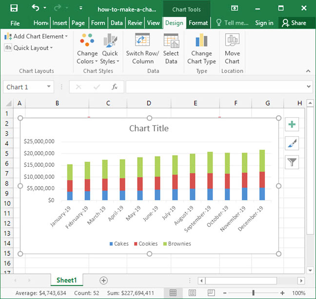
Switching rows and columns
What if we want to switch the axes on our chart: in this case, to show our product categories —
To do so, we'll select our chart, then navigate to the

On this tab, you'll see a number of chart formatting options. These options will allow you to change the chart type and select a color scheme, among other things. To solve our problem, we'll press the

Use the
Chart formatting
Once our chart is generated, we have a variety of options for labeling and formatting. To access these options, select our chart, then navigate to the
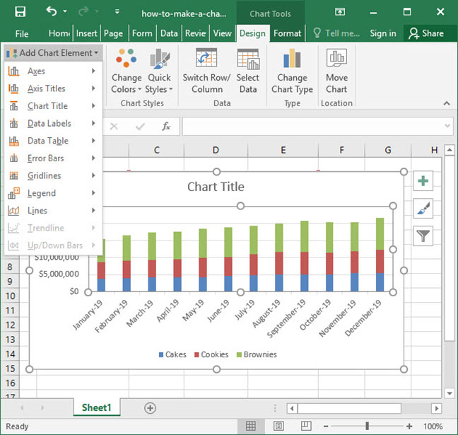
A number of options appear on this tab which will allow us to add text, data, and gridlines to our chart. Some of the most useful options are outlined below:
- Chart title. Add a header title to the chart, either centered on top of the bars, or above the bars. Once the title is added, click it once to select it, wait a few seconds, then click it again to edit the text.
- Axis titles. Add both horizontal and vertical axis labels to the graph. Once the axis labels are added, click it once to select them, wait a few seconds, then click again to edit the text.
- Legend. Adjust the appearance and position of the chart legend. The legend can be removed, or positioned to the top, bottom, left, or right of the graph.
- Axes. Adjust the axes of the chart, including axis labels and scale. Most notably, click the
More primary axis options... button to manually set the minimum and maximum limits of an axis; Excel normally sets axis limits automatically. - Data labels. Add value labels to each segment of the chart, allowing viewers to see both visual trends and actual quantitative totals.
- Data tables. Outline a table of chart values below the chart itself.
There you have it — the basics of how to make a chart in Excel! Questions or comments on the above? Be sure to let us know in the Comments section below.
Save an hour of work a day with these 5 advanced Excel tricks
Work smarter, not harder. Sign up for our 5-day mini-course to receive must-learn lessons on getting Excel to do your work for you.
- How to create beautiful table formatting instantly...
- Why to rethink the way you do VLOOKUPs...
- Plus, we'll reveal why you shouldn't use PivotTables and what to use instead...