Formatting input data
Before creating a chart, we'll need to carefully prepare a set of source data to ensure that it's clean and properly formatted. Without clean source data, it's likely that our chart will contain errors!
Formatting input data
Download the .XSLX file used in this video to follow along live.
Raw data in Excel can be difficult to interpret — particularly when we’re working with a data set that contains hundreds, or even thousands, of rows. Fortunately, Excel includes a number of easy-to-use charting and graphing capabilities that help make analyzing large chunks of data much easier. Charts allow us to display one or more series of data in a number of useful visual formats — including bar graphs, line graphs, pie charts, and scatter plots.
Before creating a chart, it’s essential to obtain an accurate and well-structured table of source data. In this lesson, we’ll learn how to structure source data tables, and go over some key rules to ensure that our source data will generate accurate charts quickly and easily.
Let’s say that our manager has asked us to prepare a chart that shows SnackWorld sales by category and year. To get started, she’s given us a complete list of SnackWorld orders from 2014-2016 in flat file format. Each individual order is broken out as a separate line item, with information on item ordered, quantity, total purchase price, and customer name.
This detailed, flat file format is perfect for making PivotTables. But it isn’t ideal when generating charts. Usually, charts work best when data is aggregated to the level at which the chart will be displayed. For example, a chart showing sales by product category and year should just include one column for each year, and one row for each product category.
How do we get our data into the proper format for charts? There are two options. One is to manually construct a table using COUNTIFS and SUMIFS formulas to pull in numbers from our Master Data tab. In this sheet, for example, we’ve manually entered category names along each row and years along each column, then filled in the missing data using a rather complex SUMIFS formula that references our main data table. We don’t go over the formula in detail here, but if you’re interested you can take a look by downloading this file and looking it over.
The second, easier option is to create a PivotTable, which we’ll do now. Let’s highlight our data set; create a PivotTable; drag the “Year” field to the “Column Labels” box; the “Category” field to the “Row labels” box; and the “Order total” field to the “Values” box. Just like that, we have a well-formatted, two-dimensional table showing SnackWorld category sales by year.
When our data table is complete, we’ll copy and paste it as values into a new tab. Why do we do this? Because if we create a chart based off of a PivotTable, we’ll actually be creating another type of object called a PivotChart. PivotCharts are pretty advanced, and we won’t go over them in this lesson — but suffice to say that copying and pasting our PivotTable data as values and creating a chart based off of the new, static data is the easiest way to get started.
There are a couple of important things to verify about our source data set before we begin:
First, our chart contains data points for all of our desired x-axis labels — in this case, each year — in the first row. These years are formatted as either numbers or text, and appear in chronological order, just as we’d like them to appear in our chart. Not all charts need to be formatted as time series; they just have to include a consistent data type for the x-axis in the first row.
Second, the top-left cell of our chart, at the intersection of row and column labels, should be empty. In this case, it isn’t, so we’ll go ahead and delete the value in that cell. This will help Excel determine that our first row of data represents x-axis headers; and our first column of data represents y-axis headers.
Third, each column contains similar types of data. The columns for 2014, 2015, and 2016 all contain numerical values that can be directly compared to each other.
Fourth, our data should not contain row or column totals, or a grand total row. If it does, this total row will be included as part of the chart, and will skew our results. In this case, our source data does contain a total row, so we’ll go ahead and delete that before continuing.
Finally, we’ll check to ensure that our data table is complete. There are no missing years, and no gaps in our sales data by category.
With these important items checked off, our data is properly formatted and ready to convert to a chart!
Every chart in Excel starts off with raw data. In this article, we'll use a sample table containing SnackWorld's 2019 sales by month and product category, shown below:
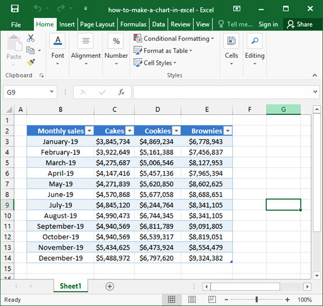
There are a couple of important things to note about our source data set before we begin:
- Consistent x-axis labels in the first row. Our chart contains data points for all of our desired x-axis labels — in this case, each month of the year — in the first row. In our sample data set, these labels are formatted as dates, starting in January and ending in December. Note that we've listed every month in order in the
Month column, and all month values are formatted in Excel's numerical date format (see our date format tutorial for more information). The column by which we'd like to graph results —Month — is the first column in our table. Not all charts need to be formatted as time series; they just have to include a consistent data type for the x-axis in the first column. - Similar types of data. After the
Month column, we have a number of other columns representing similar types of data:Cookies ,Brownies ,Cakes , etc. Note that each of these columns contains a comparable data point: monthly sales for the given category of good. - Complete data table. Finally, our data table is complete. There are no missing months, and no gaps in our sales data by category.
Whenever you're making a chart, go through the above list to ensure that your input data table is formatted properly. The vast majority of chart-based errors in Excel can be solved easily by fixing your data input table!