How to use conditional formatting
Conditional formatting is an advanced technique that makes it easier to read and interpret spreadsheets from a quick glance. It's often used to help make sense of large sheets of data that would otherwise be unintelligible — or take a long time to digest.
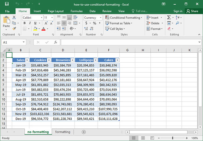
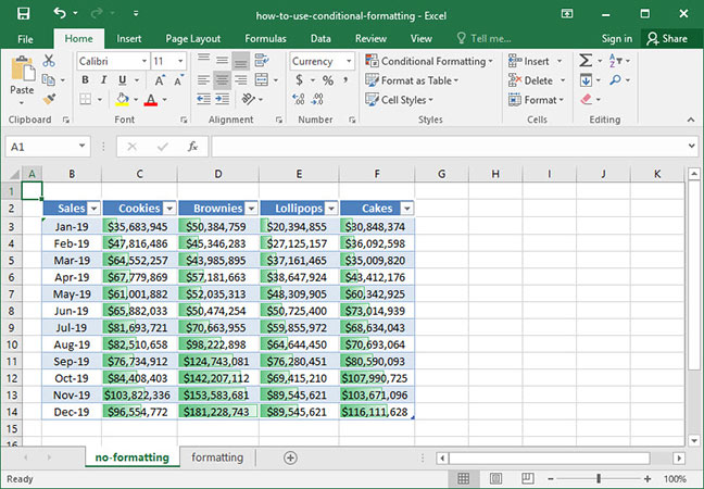
Below, we've screenshotted a typical use of conditional formatting in action. The below sheet shows SnackWorld sales by product category and month over the course of the year 2019. Notice that without any formatting or colors, the chart is fairly difficult to interpret without spending significant time looking at the numbers.
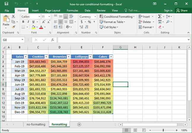
But if we apply conditional formatting to our chart — in this case, we'll tell Excel to highlight cells based on a spectrum of color, where cells that contain lower values are highlighted in red and cells that contain higher values are highlighted in green — two takeaways immediately become clear: sales are improving month-over-month across all product categories; and Brownies is consistently the company's best-selling category, particularly towards the end of the year.
Read on to find out how to use this powerful tool to make your spreadsheets easy to interpret.
Highlighting cells
Let's start with a simple example of conditional formatting based on our unformatted sales data set:
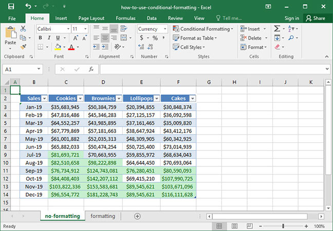
The SnackWorld CEO has set a goal of $75,000,000 product sales within each category monthly. A SnackWorld analyst has been tasked with devising a simple way to visually determine whether the category sales goal has been met in any given month. To do this, she's decided to use conditional formatting to highlight all cells in which sales are above $75,000,000.
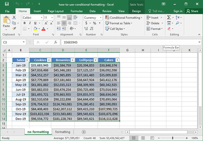
To get started on this task, we'll select the range of data that we want to conditionally format by clicking and dragging with our mouse. Note that we haven't selected the dates on the far left-hand side of the chart; if we do, Excel will recognize them as numbers and include them in the conditional formatting that we apply to the chart. We don't want to do that, since our dates are distinct from our data set.
Next, head to the
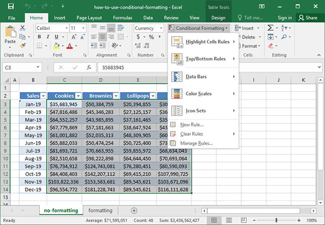
Since we want to highlight cells based on whether they are greater than a given value, we'll hover over the
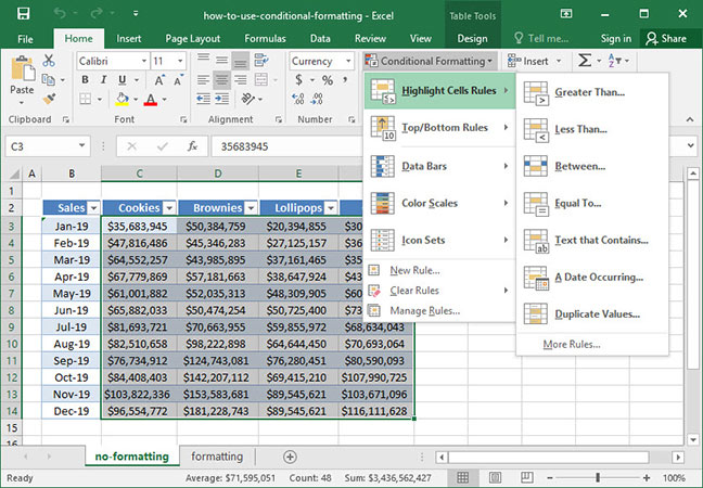
A dialogue box appears that allows us to specify two options: first, a cell value that will trigger our formatting; and second, a formatting type — in other words, what we want to happen to the cells that meet our criteria. We'll specify a
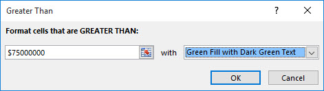
Press
Excel contains numerous additional options for highlighting cells. Here's a list of some of the other options you can find in the
- Greater than. Highlight cells that contain values greater than a set number.
- Less than. Highlight cell that contains values less than a set number.
- Between. Highlight cells with values that fall between two specified numbers.
- Equal to. Highlight cells with values that are equal to a specified number or string.
- Text that contains. Highlight cells that contain a specified string of text within them.
- A date occuring. Highlight cells containing dates that occur within a given time range.
- Duplicate values. Highlight cells that contain values that are duplicate (i.e., appear twice within the given table).
Clearing conditional formatting
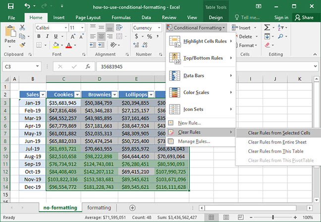
Our analyst has successfully applied conditional formatting and presented her output to the CEO. Now, she wants to reset her data table back to normal. How can she do this?
It's easy: first, select the range of data from which you would like to clear conditional formatting. Then, from the
Our conditional formatting will be cleared:
Note that we can also choose to clear rules from a given sheet, table, or Pivot Table.
Top and bottom rules
Conditional formatting provides many potential options beyond just cell highlighting rules. The
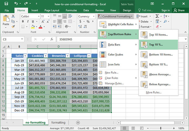
This option will open up a dialogue box that allows us to specify a top percentage to highlight and a highlight color. Let's leave the percentage at 10 and change the highlight color to green, like so:
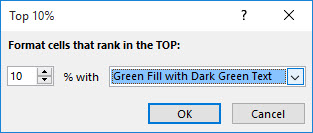
Press OK, and our Top 10% of months by sales are highlighted:
The other options available in the
- Top 10 items and bottom 10 items. Highlight the top/bottom # items by value (user-specified).
- Top 10% and bottom 10%. Highlight the top/bottom #% of items by value (user-specified).
- Above average and below average. Highlight values that are above/below the average for the data set.
Data bars and color scales
Cell highlighting is useful to show us quickly and easily whether certain points of data meet a given criteria. But it doesn't give us a particularly good view of our data set as a whole. Fortunately, Excel has two other useful tools that will allow us to visualize our sales numbers in more useful context.
The first of these features is called
To use data bars, hit the
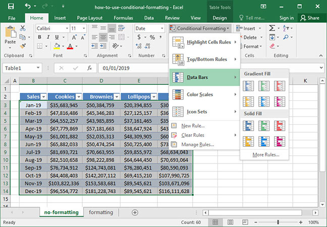
After clicking on our preferred style of data bar, our sheet updates with data bar overlays on our cells:
It's now much easier to see which months and product categories were the best and worst performers over time.
The second useful feature we'll explore is called
To get started using Color Scales, hit the
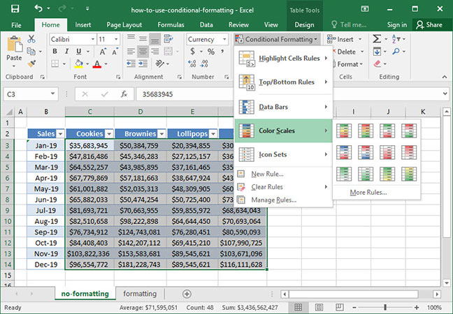
The scales shown are variable ranges with the highest numbers at the top of the graphic and the lowest numbers at the bottom. So, if we want to color our cells with the highest sales numbers in green; the middle values in yellow; and the lowest values in red, we can click the option with green at the top, yellow in the middle, and red on the bottom:
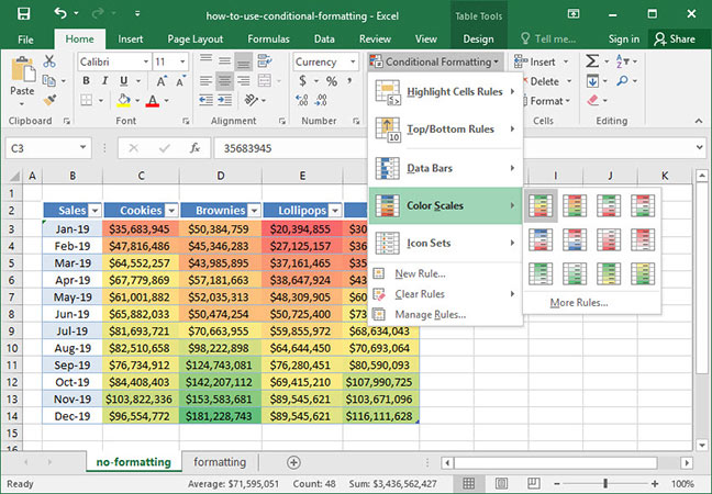
Applying this formatting type will immediately modify the colors of our chart and give us some quick insight into sales trends: Brownies are our best-performing category, especially late in the year; but sales have increased within all categories month-over-month.
Those are the basics of using conditional formatting in Excel! Now you're well-equipped to quickly apply clarifying visual styles to your data that help make it easy to interpret. Questions or comments on this piece? Be sure to let us know below!
Save an hour of work a day with these 5 advanced Excel tricks
Work smarter, not harder. Sign up for our 5-day mini-course to receive must-learn lessons on getting Excel to do your work for you.
- How to create beautiful table formatting instantly...
- Why to rethink the way you do VLOOKUPs...
- Plus, we'll reveal why you shouldn't use PivotTables and what to use instead...